Bootstrap vs Flexbox: Different Tools or Perfect Partners?
.png)

.svg)
[ key takeways ]
- Bootstrap is a framework, while Flexbox is a CSS layout model only.
- Bootstrap speeds development using components, grids, and responsive utility classes efficiently.
- Flexbox provides greater layout control, cleaner code, and customization flexibility.
- Bootstrap and Flexbox work together, since Bootstrap heavily relies on Flexbox.
- Beginners should learn Flexbox first, then Bootstrap and CSS Grid later.
.svg)
When comparing Bootstrap vs Flexbox, many developers assume they are direct competitors. In reality, they serve different purposes.
Bootstrap is a CSS framework that provides a responsive grid system, prebuilt components, and utility classes, while Flexbox is a CSS layout model used to arrange elements efficiently. Bootstrap is a framework, whereas Flexbox is a layout tool.
Understanding this difference is important for choosing the right approach to responsive web design and building maintainable websites.
In this guide, we'll compare their features, strengths, limitations, and use cases to help you decide when to use each one.
What Is Bootstrap?
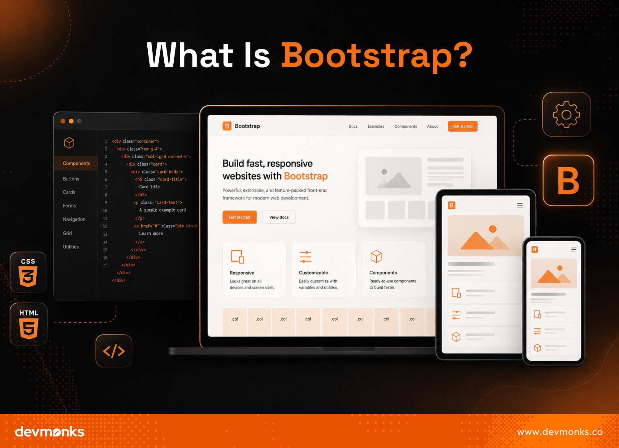
Bootstrap is a popular front-end framework used to build responsive and mobile-friendly websites. It provides prebuilt components, CSS classes, and a responsive grid system that help developers create layouts faster.
Instead of coding every element from scratch, developers can use Bootstrap's ready-made tools to streamline development.
Key Features of Bootstrap
Bootstrap includes a flexible grid system for organizing content into rows and columns. It also offers UI components such as Navbars, buttons, forms, and Card components.
Utility classes make it easy to control spacing, colors, alignment, and other styling needs. Responsive breakpoints ensure layouts adapt smoothly across different screen sizes.
Advantages of Bootstrap
Bootstrap speeds up development with reusable components and predefined styles. It helps maintain design consistency and offers a large ecosystem of themes, templates, plugins, and community resources.
Bootstrap speeds up development with reusable components and predefined styles.
This is one reason why development agencies such as Dev Monks often use Bootstrap when building responsive websites and web applications under tight timelines.
Limitations of Bootstrap
Websites built with Bootstrap can sometimes have a similar appearance because of its default styling.
The framework also adds extra CSS code, which can increase file size. While customization is possible, creating a completely unique design may require additional effort and style overrides.
What Is Flexbox?
Flexbox, short for Flexible Box Layout, is a CSS layout module designed for one-dimensional layouts. It helps developers arrange elements in a row or a column without relying on complex positioning methods.
Flexbox is built directly into CSS, which makes it a simple and powerful tool for creating flexible layouts.
How Flexbox Works
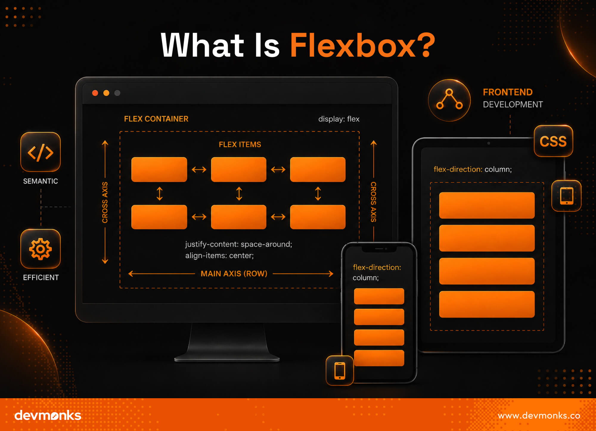
Flexbox works through a Flex container that holds one or more Flex items. The layout is controlled along two directions, the Main axis and the Cross axis.
The main axis defines the primary direction in which items are placed, while the cross axis runs perpendicular to it. This structure makes it easier to align, distribute, and reorder elements.
Common Flexbox Properties
Developers activate Flexbox using display:flex. Properties like justify-content control item placement along the main axis, while align-items manages alignment on the cross axis.
Other useful properties include flex-direction for changing layout direction and flex-wrap for controlling item wrapping.
Advantages of Flexbox
Flexbox offers greater layout control, cleaner code, and native CSS support without external frameworks.
Limitations of Flexbox
Flexbox has a steeper learning curve for beginners and does not include prebuilt components or UI elements.
Bootstrap vs Flexbox: Side-by-Side Comparison
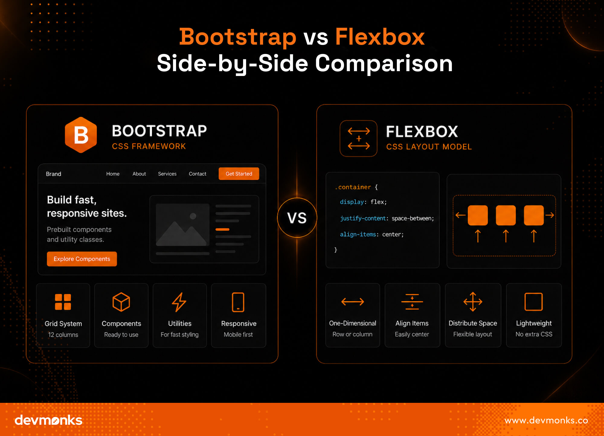
Both Bootstrap and Flexbox help developers build modern website layouts, but they serve different purposes.
Bootstrap is a complete CSS framework with ready-made UI components, while Flexbox is a CSS layout model focused on arranging elements efficiently. The table below highlights the main differences.
Purpose
Bootstrap is a full CSS framework that includes styling, layouts, and UI components. Flexbox is a layout model built into CSS and is mainly used to control the positioning and alignment of elements.
Learning Curve
Bootstrap is generally easier for beginners because many features are ready to use. Flexbox requires developers to understand concepts such as alignment, direction, and spacing before using it effectively.
Customization
Flexbox offers greater control over layouts and element positioning. Bootstrap can be customized, but developers often need to override existing styles to achieve unique designs.
Responsiveness
Bootstrap includes a responsive grid system and predefined breakpoints. Flexbox can also create responsive layouts, but developers must define the behavior themselves using CSS rules and media queries.
Performance
Bootstrap adds extra CSS files and features that may not always be needed. Flexbox is part of native CSS, which makes it lighter and reduces unnecessary overhead.
Components
Bootstrap comes with ready-made UI components such as Navbars, buttons, modals, forms, and cards. Flexbox does not provide components. It only offers layout tools that developers can use to build custom interfaces from scratch.
How Bootstrap Uses Flexbox Internally?
Many developers compare Bootstrap and Flexbox, but Bootstrap actually relies heavily on Flexbox behind the scenes. Since Bootstrap 4, much of its layout system has been built using Flexbox.
This means the Bootstrap grid vs Flexbox debate is not always a direct comparison, as the framework uses the layout model to power many of its features.
Bootstrap Grid and Flex Utilities
Bootstrap includes several flex utilities that make working with layouts easier. For example, d-flex turns an element into a flex container.
The justify-content-center class centers items along the main axis, while align-items-center aligns them along the cross axis. These Bootstrap flex utilities allow developers to create flexible layouts without writing custom CSS.
Why They Are Not Competitors
Bootstrap and Flexbox are best viewed as complementary tools rather than competitors. Flexbox provides the layout foundation, while Bootstrap builds on top of it with a grid system, responsive features, and ready-made components.
In many projects, developers use both together to create responsive and visually consistent websites more efficiently.
Bootstrap Grid vs Flexbox
Although Bootstrap's grid system is built using Flexbox, the two are often used differently when creating a responsive layout. Understanding their layout approach helps developers choose the right tool for each situation.
One-Dimensional vs Two-Dimensional Layouts
Flexbox is designed for one-dimensional layouts. It controls elements in a single direction, either a row or a column. Bootstrap's grid system, on the other hand, organizes content into rows and columns, creating a more structured layout.
This makes it easier to manage multiple sections across a page.
When Grid Works Better
A grid-based approach works best for complex page structures where content must align across both rows and columns.
Examples include dashboards, admin panels, landing pages, and multi-section website layouts. For these cases, a grid system provides better organization and consistency.
When Flexbox Works Better
Flexbox is ideal for smaller interface elements that require precise alignment. It works especially well for navigation bars, card layouts, menus, toolbars, and groups of buttons.
When you need to control spacing, alignment, or item order within a single row or column, Flexbox is usually the better choice than CSS Grid or a full grid system.
Code Example: Bootstrap vs Flexbox Layout
Both Bootstrap and Flexbox can create the same responsive layout. The main difference is how the layout is structured and managed.
Bootstrap Example
Bootstrap uses rows and columns to organize content.
<div class="container">
<div class="row">
<div class="col-md-6">Column 1</div>
<div class="col-md-6">Column 2</div>
</div>
</div>
In this example, the row creates a horizontal section, while the col-md-6 classes split the space into two equal columns. Bootstrap handles responsiveness automatically through its grid system.
Pure Flexbox Example
Flexbox uses a flex container to control item placement.
<div class="flex-container">
<div>Column 1</div>
<div>Column 2</div>
</div>
.flex-container {
display: flex;
}
.flex-container div {
flex: 1;
}
Here, the flex container places both items in a row and gives them equal width. Alignment and spacing can be adjusted using Flexbox properties.
Code Complexity Comparison
Bootstrap requires less custom CSS and speeds up development. Flexbox offers more control but often needs additional styling.
For simple responsive layouts, Bootstrap is usually faster. For highly customized CSS layout techniques, Flexbox provides greater flexibility and maintainability.
Bootstrap vs Flexbox for Responsive Design
Both Bootstrap and Flexbox support responsive design, but they approach it differently. Bootstrap provides built-in responsive tools, while Flexbox relies on custom CSS and media queries to adapt layouts across devices.
Mobile-First Design
Modern websites are usually built using a mobile-first approach. Bootstrap follows this philosophy by including predefined breakpoints for different screen sizes.
Similar mobile-first principles are also found in popular mobile app development tools used to create cross-platform applications.
Flexbox also supports mobile-first design, but developers must create their own media queries to control layout changes.
Responsive Utilities in Bootstrap
Bootstrap makes responsive design easier with utility classes and grid breakpoints. Classes such as col-md and col-lg adjust column widths based on screen size.
The d-none utility can hide elements on specific devices. These features reduce the need for custom CSS and speed up development.
Flexbox and Media Queries
Flexbox provides complete control over responsive layouts. Developers can combine Flexbox properties with media queries to change direction, spacing, alignment, and item order at different screen sizes.
While this requires more code, it allows highly customized responsive design solutions that match specific project needs.
Bootstrap vs Flexbox Performance Comparison
Performance is an important factor when choosing between Bootstrap and Flexbox. While both can create efficient layouts, they differ in file size, overhead, and long-term maintainability.
CSS File Size
Bootstrap includes a large collection of components, utilities, and responsive features. As a result, it adds more CSS code to a project, even if many features are not used.
Flexbox is built into CSS, so it does not require loading an additional framework.
Rendering Performance
Flexbox relies on native browser CSS capabilities, which makes it lightweight and efficient. Bootstrap layouts also perform well, but the extra framework code can increase page size and resource usage.
For small projects, pure CSS often provides a leaner solution.
Maintainability
Flexbox can lead to cleaner and more organized code because developers write only the styles they need.
Bootstrap simplifies development but may introduce unused classes and framework dependencies over time. For highly customized projects, Flexbox often offers a more maintainable architecture.
When Should You Use Bootstrap?
Bootstrap is a great choice when speed and consistency are more important than deep customization. Its ready-made components and responsive features help teams launch projects faster.
Rapid Prototyping
Bootstrap is ideal for rapid prototyping because developers can quickly build layouts and interface elements without writing large amounts of custom CSS.
Small Teams
Small teams often benefit from Bootstrap's standardized structure. It helps maintain a consistent design and reduces the time spent creating common UI elements.
MVP Development
When building an MVP (Minimum Viable Product), speed is critical. Bootstrap allows teams to focus on functionality while using prebuilt components for the interface.
Admin Dashboards
Bootstrap works particularly well for admin dashboards. Its grid system, forms, tables, cards, and navigation components make it easy to create organized and responsive dashboard layouts with minimal effort.
When Should You Use Flexbox?
Flexbox is a strong choice when you need complete control over layouts and want to create a unique user interface. It is especially useful for projects that prioritize flexibility and clean CSS.
Custom UI Design
Flexbox works well for custom UI design because it gives developers precise control over alignment, spacing, and element positioning without relying on framework defaults.
Lightweight Websites
For lightweight websites, Flexbox helps reduce unnecessary code. Since it is built into CSS, there is no need to load a separate framework.
Component-Based Systems
Flexbox is commonly used in component architecture, where individual interface elements need flexible and reusable layouts. It makes it easier to manage the structure of independent components.
Design Systems
Many modern design systems use Flexbox to create consistent and adaptable layouts. Its flexibility helps developers build scalable interfaces that remain easy to maintain as projects grow.
Can You Use Bootstrap and Flexbox Together?
Yes, you can use Bootstrap and Flexbox together, and many developers do. In fact, modern versions of Bootstrap are built on Flexbox, so the two technologies work naturally alongside each other.
A common approach is to use the Bootstrap grid system for the overall page structure and add custom Flexbox rules for more precise alignment within specific sections.
For example, you can create a page layout with Bootstrap rows and columns while using Flexbox to center content inside a card.
You can also combine Bootstrap components with Flexbox alignment utilities to build responsive and highly customized interfaces with minimal effort.
Bootstrap vs Flexbox vs CSS Grid
Bootstrap, Flexbox, and CSS Grid are all useful for building modern layouts, but they serve different purposes. Understanding their roles helps developers choose the right tool for each project.
Bootstrap
Bootstrap is a complete front-end framework. It includes a responsive grid system, utility classes, and ready-made components such as buttons, forms, and navigation bars. It is designed to speed up development.
Flexbox
Flexbox is a CSS layout model built for one-dimensional layouts. It works best when arranging items in a single row or column and provides excellent control over alignment and spacing.
CSS Grid
CSS Grid is a layout system designed for two-dimensional layouts. Unlike Flexbox, it manages both rows and columns at the same time, which makes it ideal for complex page structures.
Which One Should Beginners Learn First?
Beginners should start with Flexbox because it teaches core layout concepts. Next, learn CSS Grid for advanced layouts.
After that, Bootstrap becomes easier to understand since its Bootstrap grid system and many responsive features are built on these CSS layout techniques.
FAQs
Does Flutter Use Flexbox?
Flutter does not use Flexbox directly. Instead, it uses its own layout system with widgets such as Row and Column, which work similarly to Flexbox. These widgets allow developers to control alignment, spacing, and element positioning in a flexible way.
Which One Is Easier, Bootstrap or Tailwind?
Bootstrap is generally easier for beginners because it provides prebuilt components and ready-made styles. Tailwind offers more customization but requires learning many utility classes. If you want a faster setup, Bootstrap is usually the simpler option.
Is Bootstrap or MUI Better?
Neither is universally better. Bootstrap is ideal for quick development and framework-independent projects. MUI is designed specifically for React and follows Material Design principles. Choose Bootstrap for versatility and MUI when building modern React applications.
Bottomline
Bootstrap and Flexbox are not competing technologies. Bootstrap is a complete framework, while Flexbox is a CSS layout model that Bootstrap itself uses.
Choose Bootstrap for faster development and Flexbox for greater layout control. Understanding both will help you build responsive, maintainable, and modern web applications more effectively.
.png)
.svg)
Frequently Asked Questions
How can I discuss an AI MVP with Dev Monks?

Book a strategy call with your use case, existing systems, and project priorities. The team can help define an initial scope and the dependencies that need to be addressed.
Does using AI replace engineering review?
Dev Monks uses AI-assisted workflows with human-guided decisions. Product requirements, engineering choices, and testing remain part of the development process.
What AI development services does Dev Monks offer?
Dev Monks offers agentic AI solutions, custom language-model solutions, workflow automation, and RAG development. Its broader services include SaaS engineering, MVP development, backend integrations, and web and mobile applications.
Is Dev Monks an official OpenAI Select Partner?
Yes. Dev Monks is now an official OpenAI Select Partner within the OpenAI Partner Network.
How long does it usually take to complete a project?
We combine AI-driven workflows with product-first engineering to provide MVP development services for startups and enterprises. Our approach balances speed, reliability, and usability while keeping teams involved. We deliver production-ready, scalable solutions, not just prototypes or demos.
What makes Dev Monks different from other development companies?
We combine AI-driven workflows with product-first engineering to provide MVP development services for startups and enterprises. Our approach balances speed, reliability, and usability while keeping teams involved. We deliver production-ready, scalable solutions, not just prototypes or demos.
How Involved Will My Team be During Development?
We combine AI-driven workflows with product-first engineering to provide MVP development services for startups and enterprises. Our approach balances speed, reliability, and usability while keeping teams involved. We deliver production-ready, scalable solutions, not just prototypes or demos.
How involved will my team be during development?
We combine AI-driven workflows with product-first engineering to provide MVP development services for startups and enterprises. Our approach balances speed, reliability, and usability while keeping teams involved. We deliver production-ready, scalable solutions, not just prototypes or demos.
Do you develop both web and mobile applications?
We combine AI-driven workflows with product-first engineering to provide MVP development services for startups and enterprises. Our approach balances speed, reliability, and usability while keeping teams involved. We deliver production-ready, scalable solutions, not just prototypes or demos.
How can Dev Monks help my startup launch faster
We combine AI-driven workflows with product-first engineering to provide MVP development services for startups and enterprises. Our approach balances speed, reliability, and usability while keeping teams involved. We deliver production-ready, scalable solutions, not just prototypes or demos.

%20vs%20new%20Date().jpg)