CSS Relative vs Absolute: Explained with Examples & Figures
.png)

.svg)
[ key takeways ]
- Relative positioning moves elements while preserving their original space in the document layout.
- Absolute positioning removes elements from normal flow for precise placement inside containers.
- Use relative for small adjustments and absolute for overlays, badges, and floating elements.
- An absolute element positions itself relative to its nearest positioned parent, not always the page.
- Combine relative and absolute positioning carefully to create responsive, predictable, and maintainable CSS layouts.
.svg)
CSS relative vs absolute refers to two positioning methods that control where elements appear on a web page. Relative positioning moves an element from its original location while keeping its space in the layout.
Absolute positioning removes the element from the normal document flow and places it relative to its nearest positioned parent.
Understanding this difference is essential for building clean, responsive, and predictable web layouts. It helps you position badges, tooltips, overlays, buttons, and other UI elements without breaking your design.
In this guide, you'll learn how both positioning methods work, when to use each one, their key differences, and the best practices for modern CSS development.
What Is CSS Positioning?
CSS positioning is the process of controlling where an HTML element appears on a web page. It uses the position property to decide how an element is placed within a CSS layout.
By default, elements follow the normal document flow. However, there are times when you need to move an element to a specific spot. That is where CSS positioning becomes useful.
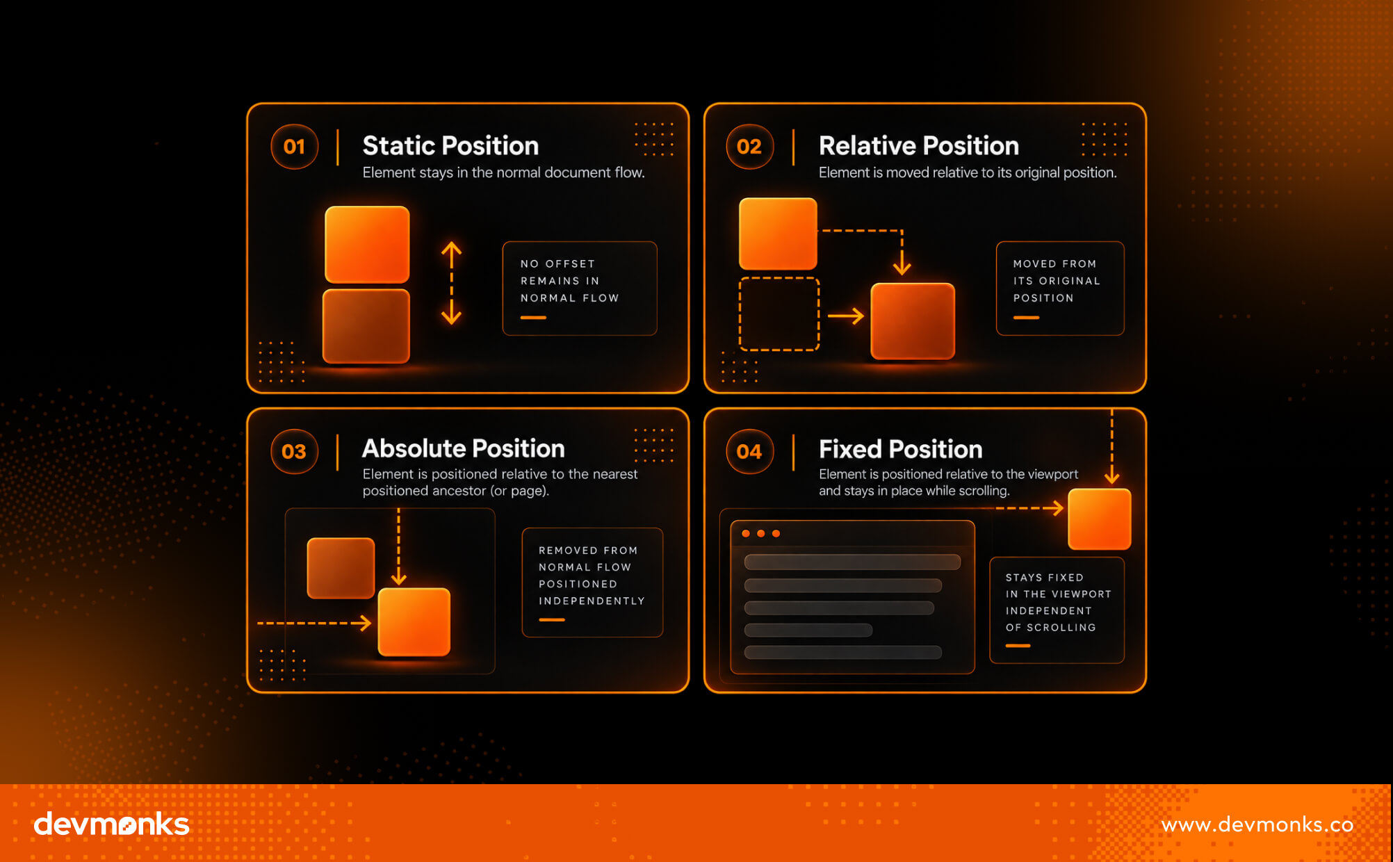
The position property offers five position values: static, relative, absolute, fixed, and sticky. Each one behaves differently and serves a different purpose.
CSS positioning gets easier once you understand how relative and absolute positioning work together.
If you're building a production-ready website and need help turning those concepts into a responsive, scalable design, Dev Monks web development agency can help.
What Is Relative Positioning in CSS?
Relative positioning lets you move an element from its normal position without removing it from the page layout. You can apply position: relative to an element and then use offset properties like top, right, bottom, or left to shift it.
The important thing to remember is that the element still keeps its original space in the document. Other elements behave as if it never moved.
This makes position: relative a great choice when you only need to make small adjustments without affecting the overall layout.
It is also commonly used to create a positioning context for child elements. If a child element uses position: absolute, it will be positioned relative to the nearest parent with position: relative.
How Relative Positioning Works
When you set position: relative, the element stays in the normal document flow. The offset properties simply move its visible location.
- top moves the element down.
- bottom moves the element up.
- left moves the element to the right.
- right moves the element to the left.
The original space of the element remains reserved. This means nearby elements do not move to fill the gap, making relative positioning predictable and easy to use for small layout changes.
Example of Relative Positioning
.box {
position: relative;
top: 20px;
left: 30px;
}
In this example, the element moves 20 pixels down and 30 pixels to the right. Even though it appears in a new location, it still occupies its original space in the layout.
Think of it as sliding a picture inside its frame. The picture moves, but the frame stays where it is.
Common Use Cases for Relative Positioning
Relative positioning is useful in many everyday CSS layouts, including:
- Small adjustments: Move buttons, icons, or text slightly without changing the surrounding layout.
- Creating a positioning context: Set position: relative on a parent element so child elements with position: absolute are positioned inside that parent instead of the entire page.
- Badge positioning: Place notification badges, labels, or small icons on cards, images, or buttons.
- UI tweaks: Fine-tune the placement of elements to improve alignment and create a polished user interface.
What Is Absolute Positioning in CSS?
Absolute positioning lets you place an element exactly where you want it. When you use position: absolute, the element is removed from the normal document flow.
It no longer reserves space in the layout, so nearby elements behave as if it is not there. This gives you precise control over an element's location without changing the position of other content.
How Absolute Positioning Works
An element with position: absolute is positioned using the top, right, bottom, and left properties. Its position is based on its containing block, which is usually the nearest positioned ancestor.
A positioned ancestor is any parent element with a position value other than static, such as relative.
If no positioned ancestor exists, the browser positions the element relative to the page instead. This is why developers often set position: relative on a parent container before using position: absolute on a child element.
Example of Absolute Positioning
HTML
<div class="card">
<span class="badge">New</span>
<img src="product.jpg" alt="Product">
</div>
CSS
.card {
position: relative;
}
.badge {
position: absolute;
top: 10px;
right: 10px;
}
In this example, the badge appears in the top-right corner of the card. It is positioned relative to the card, not the entire page, because the parent has position: relative.
Common Use Cases for Absolute Positioning
Absolute positioning is commonly used for elements that need to float above other content or stay in a precise location.
Common examples include tooltips, modals, notification badges, icons inside input fields, floating action buttons, and decorative graphics.
Since these elements do not affect the surrounding layout, they are perfect for overlays, popups, and other floating UI components.
CSS Relative vs Absolute (Complete Comparison)
Relative positioning moves an element while keeping its place in the layout, whereas absolute positioning removes the element from the layout and places it at a specific location.
Both relative and absolute positioning help you control where elements appear, but they work in very different ways.
With relative positioning, the element stays in the normal document flow. You can move it using offset properties, but it still keeps its original space. This makes it ideal for small layout adjustments and for creating a positioning context for child elements.
With absolute positioning, the element is removed from the normal document flow. It no longer takes up space, so other elements ignore it.
Instead, it is positioned relative to its nearest positioned parent. This makes it perfect for overlays, badges, tooltips, and other floating UI elements.
Knowing when to use each method helps you build cleaner, more responsive layouts and avoid unexpected positioning issues.
Key Differences at a Glance
Relative vs Absolute
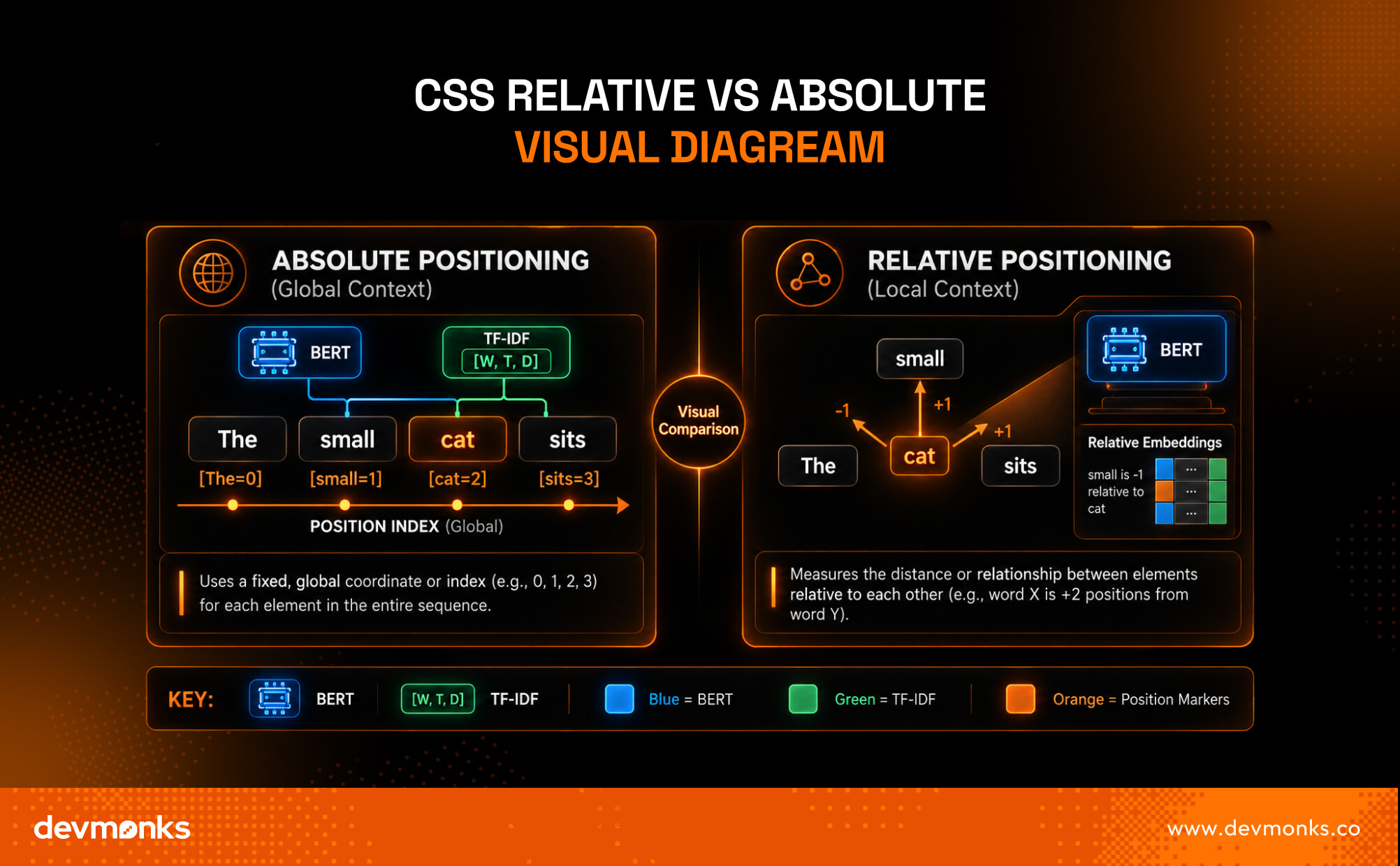
The illustration below shows the core difference. Relative positioning moves an element from its original location while keeping its space in the layout.
Absolute positioning removes the element from the normal flow and places it relative to its nearest positioned parent, allowing it to float independently.
Understanding Positioning Context (Parent vs Child)
In real-world CSS layouts, relative and absolute positioning are often used together. This combination gives you precise control over child elements while keeping them attached to a specific parent.
Instead of placing an element anywhere on the page, you can position it exactly where it belongs inside a container.
Why Parents Usually Use position: relative
A parent element is commonly given position: relative to create a positioning context. On its own, this does not change the parent's location.
Instead, it tells the browser that any child with position: absolute should be positioned relative to this parent.
This approach makes layouts more organized and predictable. For example, you can place a notification badge on a profile picture or position a button inside a card without affecting the rest of the page.
Why Absolute Elements Need a Positioned Ancestor
An element with position: absolute always looks for its nearest positioned ancestor. If it finds a parent with position: relative (or another non-static position), it uses that parent as its reference point.
If no positioned ancestor exists, the element falls back to the viewport. This means it is positioned relative to the browser window instead of the intended container.
As a result, the element may appear in the wrong place, especially on responsive layouts.
That is why developers usually pair a relative parent with an absolute child. It keeps floating elements anchored to the correct container and makes the layout easier to manage across different screen sizes.
Common Mistakes Developers Make
CSS positioning is straightforward once you understand the basics. However, these common mistakes can lead to confusing layouts and unexpected behavior.
- Forgetting the relative parent: An absolutely positioned element needs a positioned parent. Without position: relative on the parent, it may be placed relative to the viewport instead of the intended container.
- Elements disappearing: Sometimes an element seems to vanish because it is positioned outside its container or gets clipped by overflow: hidden.
- z-index confusion: If overlapping elements do not stack correctly, check their z-index values. Also remember that z-index only works on positioned elements.
- Responsive layout issues: Absolute positioning can look perfect on one screen but break on another. Always test your layout on different devices and avoid using fixed offsets unless necessary.
- Overusing absolute positioning: Not every layout problem needs position: absolute. Use normal CSS layout methods like Flexbox or Grid whenever possible, and reserve positioning for elements that truly need precise placement.
Best Practices for Using Relative and Absolute Positioning
To build clean, responsive layouts, use CSS positioning only when it is the right tool for the job. These best practices will help you avoid common layout problems.
- Use Flexbox or CSS Grid for layouts: Build page structures with Flexbox or CSS Grid. Use relative and absolute positioning for specific elements, not the entire layout.
- Reserve absolute positioning for overlays: Use position: absolute for tooltips, badges, popups, floating buttons, and other overlay elements that should not affect the layout.
- Keep positioning predictable: Set position: relative on the parent when using an absolutely positioned child. This keeps elements anchored to the correct container.
- Avoid magic numbers: Do not rely on large fixed pixel values to place elements. Use logical spacing and test your design on different screen sizes to create a more responsive layout.
Following these best practices helps create layouts that are easier to maintain and scale.
Mastering CSS positioning is an important part of building modern websites. As you continue learning front-end development, you also need to understand the concept of headless in web development, especially if you plan to work with modern CMS platforms and JavaScript frameworks.
If you need a custom website built with modern CSS techniques and responsive design, Dev Monks web development agency can help deliver clean, high-performance solutions.
Relative vs Absolute vs Fixed vs Sticky
CSS provides four commonly used positioning methods, and each one serves a different purpose. Choosing the right one depends on how you want an element to behave in the layout and during scrolling.
There is no single "best" positioning method.
Relative is ideal for small adjustments, absolute is best for precise placement inside a container, fixed keeps elements visible on the screen at all times, and sticky combines normal scrolling with a fixed effect when needed.
Understanding these differences helps you choose the right positioning method for every layout.
CSS positioning is one of the core concepts every front-end developer learns. If you're just starting out, understanding the time needed to learn web development can help you set realistic expectations and plan and build your skills step by step.
FAQs
Does Absolute Positioning Affect Layout?
No. An element with position: absolute is removed from the normal document flow. It does not reserve space, so surrounding elements are positioned as if it does not exist. This is why absolute positioning is commonly used for overlays, badges, and floating UI elements.
Can Absolute Elements Be Responsive?
Yes. Absolute elements can be responsive when they are positioned inside a responsive parent. Use relative units like %, rem, or viewport units where appropriate, and test your layout on different screen sizes instead of relying on fixed pixel values.
Why Isn't My Absolute Element Staying Inside Its Parent?
This usually happens because the parent does not have position: relative or another non-static position. Without a positioned parent, the absolutely positioned element uses the viewport as its reference point instead of the intended container.
Final Verdict
Understanding CSS relative vs absolute positioning is essential for building clean and responsive layouts.
Relative positioning is ideal for small adjustments and creating a positioning context, while absolute positioning is best for overlays and precisely placed elements.
Use each where it fits, combine them when needed, and rely on Flexbox or CSS Grid for your main page layout.
.png)
.svg)
Frequently Asked Questions
How long does it usually take to complete a project?

We combine AI-driven workflows with product-first engineering to provide MVP development services for startups and enterprises. Our approach balances speed, reliability, and usability while keeping teams involved. We deliver production-ready, scalable solutions, not just prototypes or demos.
What makes Dev Monks different from other development companies?
We combine AI-driven workflows with product-first engineering to provide MVP development services for startups and enterprises. Our approach balances speed, reliability, and usability while keeping teams involved. We deliver production-ready, scalable solutions, not just prototypes or demos.
How Involved Will My Team be During Development?
We combine AI-driven workflows with product-first engineering to provide MVP development services for startups and enterprises. Our approach balances speed, reliability, and usability while keeping teams involved. We deliver production-ready, scalable solutions, not just prototypes or demos.
How involved will my team be during development?
We combine AI-driven workflows with product-first engineering to provide MVP development services for startups and enterprises. Our approach balances speed, reliability, and usability while keeping teams involved. We deliver production-ready, scalable solutions, not just prototypes or demos.
Do you develop both web and mobile applications?
We combine AI-driven workflows with product-first engineering to provide MVP development services for startups and enterprises. Our approach balances speed, reliability, and usability while keeping teams involved. We deliver production-ready, scalable solutions, not just prototypes or demos.
How can Dev Monks help my startup launch faster
We combine AI-driven workflows with product-first engineering to provide MVP development services for startups and enterprises. Our approach balances speed, reliability, and usability while keeping teams involved. We deliver production-ready, scalable solutions, not just prototypes or demos.